Everyone can tell when a website looks expensive, and almost no one can say why. It is rarely the budget. Some of the costliest sites on the web look cheap, and some of the most striking were made by two people in a week. What separates them is a short list of decisions, and most of those decisions are about what to leave out.
We design every UOVA template against that list before a model ever fills it with words and pictures. Here it is, with the templates that show each decision at work.
1. One palette, used like it costs money
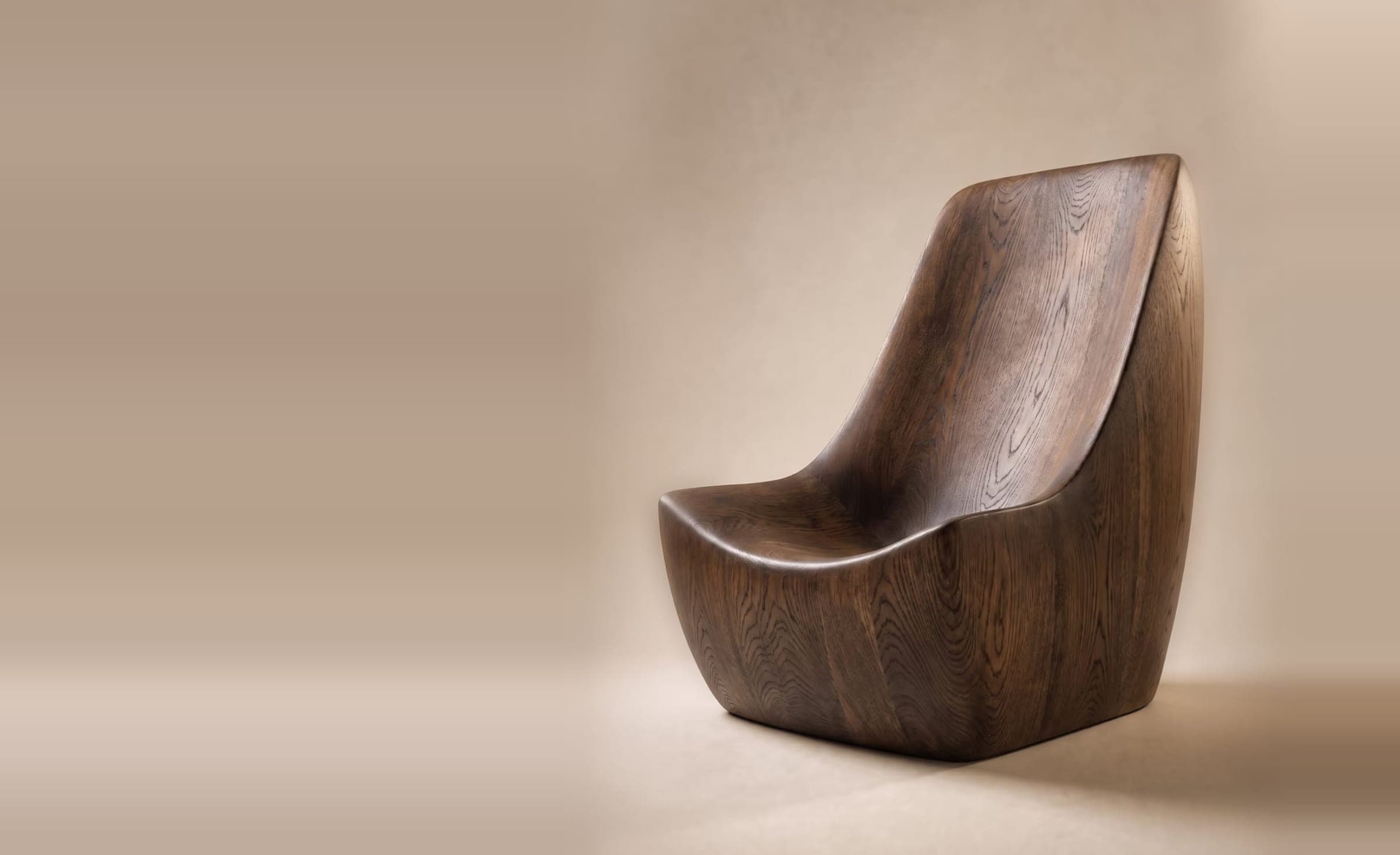
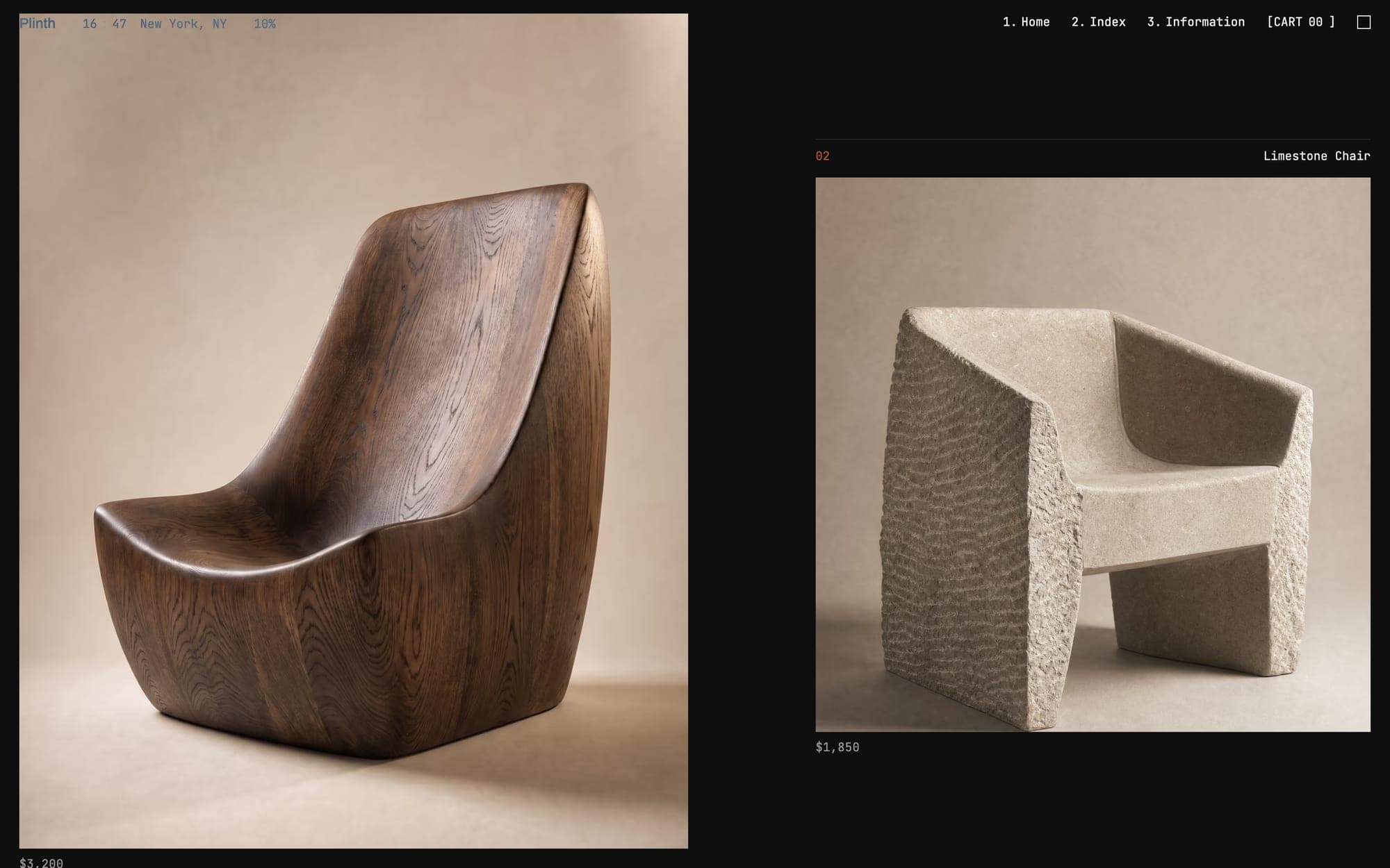
Cheap sites use colour to get louder. Expensive sites use so little of it that the photography does the talking. Plinth, our template for a sculptural furniture studio, runs almost entirely on near-black and warm off-white. The only colour on the page belongs to the oak, limestone and basalt of the pieces themselves. When the palette steps back, the product steps forward.
2. Type at the scale of architecture
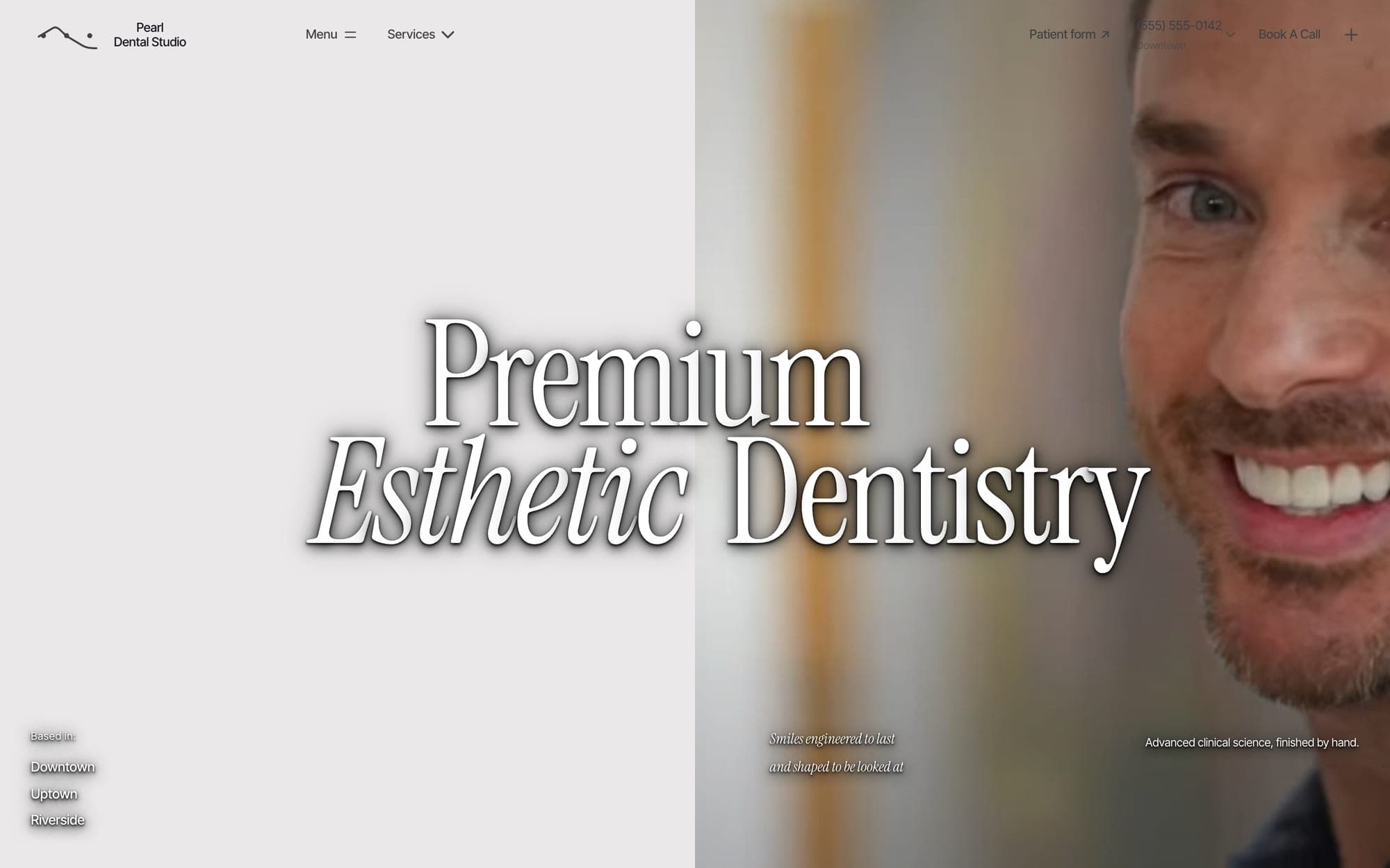
Look closely at a luxury house and the typography is either enormous or small, almost never in between. A headline that spans the full width of the screen is a statement of confidence. Body copy set small, with generous space around it, says you do not need to shout. Plinth opens on its own name, edge to edge. Pearl, our template for an aesthetic dental studio, sets “Premium Esthetic Dentistry” in a condensed serif with one italic turn. It reads more like a fragrance house than a clinic, which is exactly the point.
3. Photography lit by one sun
The fastest way to cheapen a page is imagery that disagrees with itself: five stock photos, five lighting set-ups, five colour temperatures. Expensive pages feel like one photographer shot them in one session. Every frame obeys the same light, the same lens and the same mood. This is also why generated imagery finally works on premium sites. The newest image models can hold a single light source and a single material across a whole set, so a catalogue looks like a shoot, not a collage.
4. Space that looks deliberate
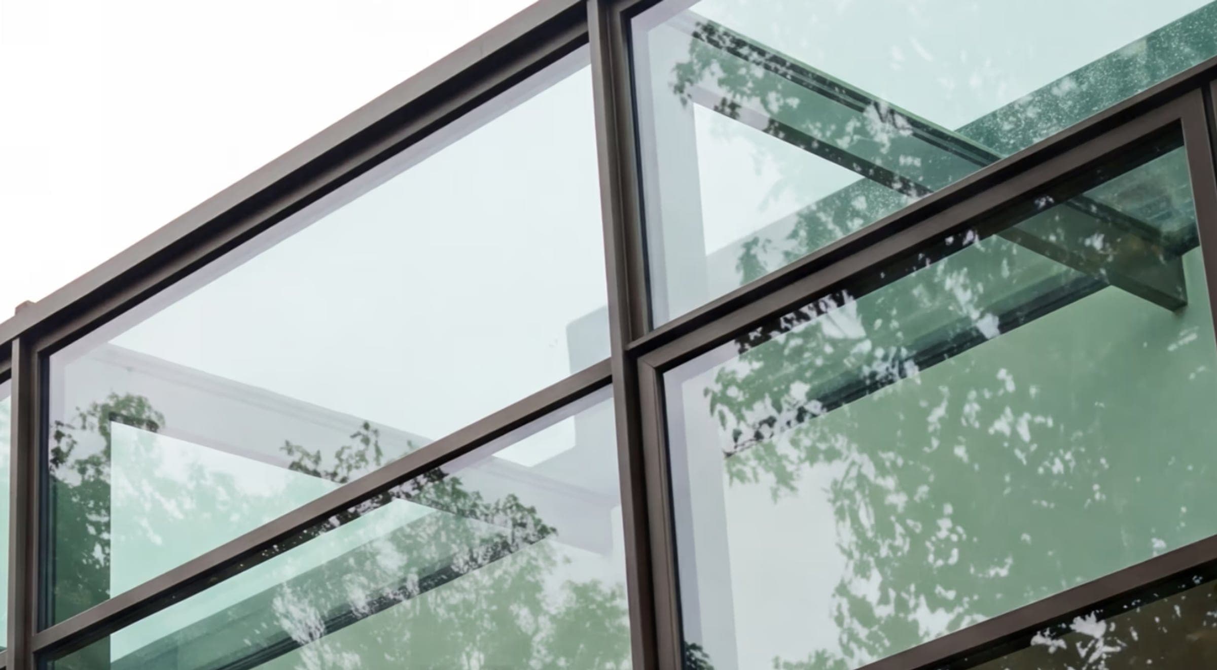
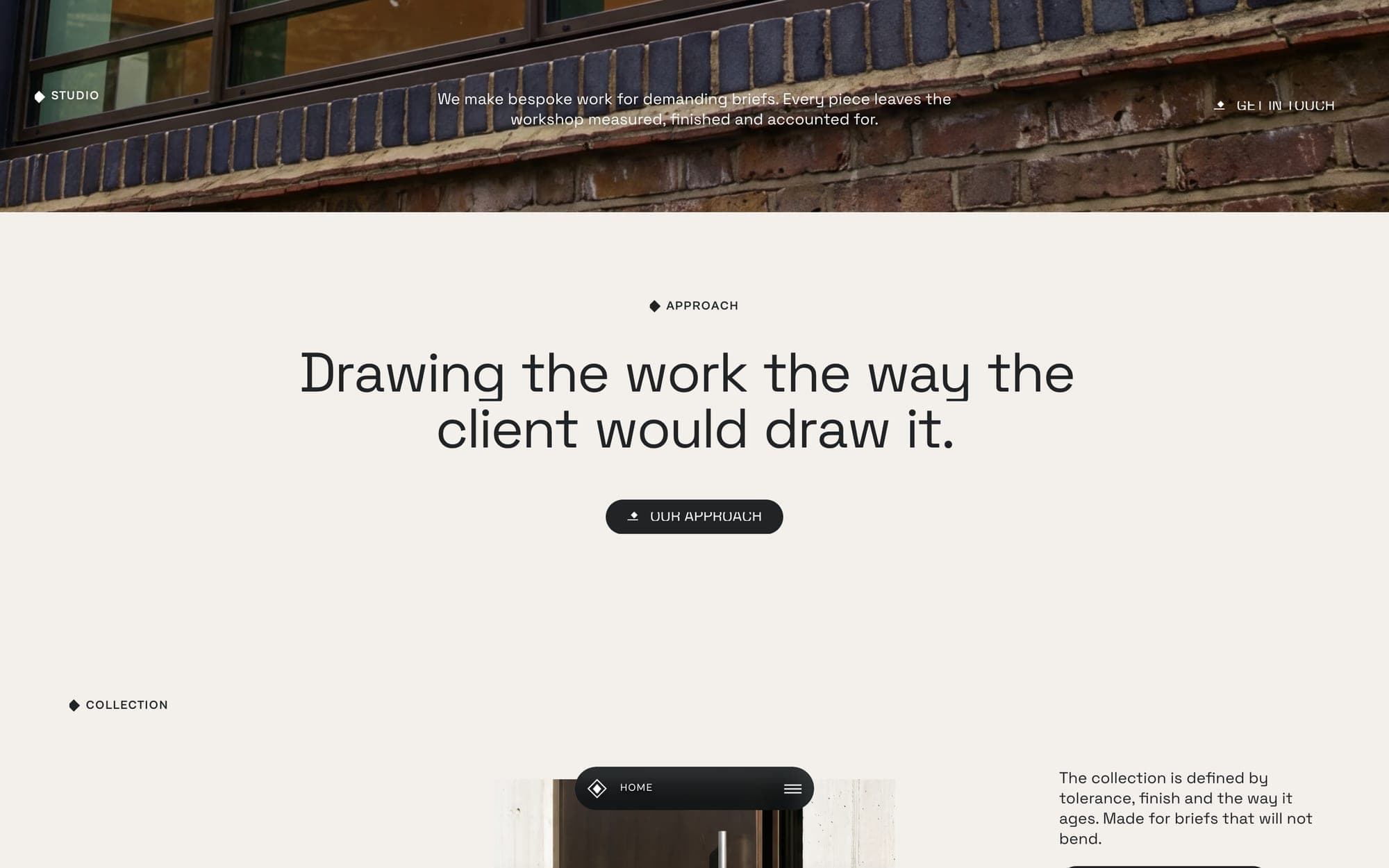
Whitespace is not empty. It is the pause that tells a visitor where to look. Clarion, our template for an architectural glazing studio, gives a single sentence an entire screen. “Drawing the work the way the client would draw it” sits alone on warm stone, with one button beneath it. The page takes its time, so the visitor does too.
5. Motion with a reason to exist
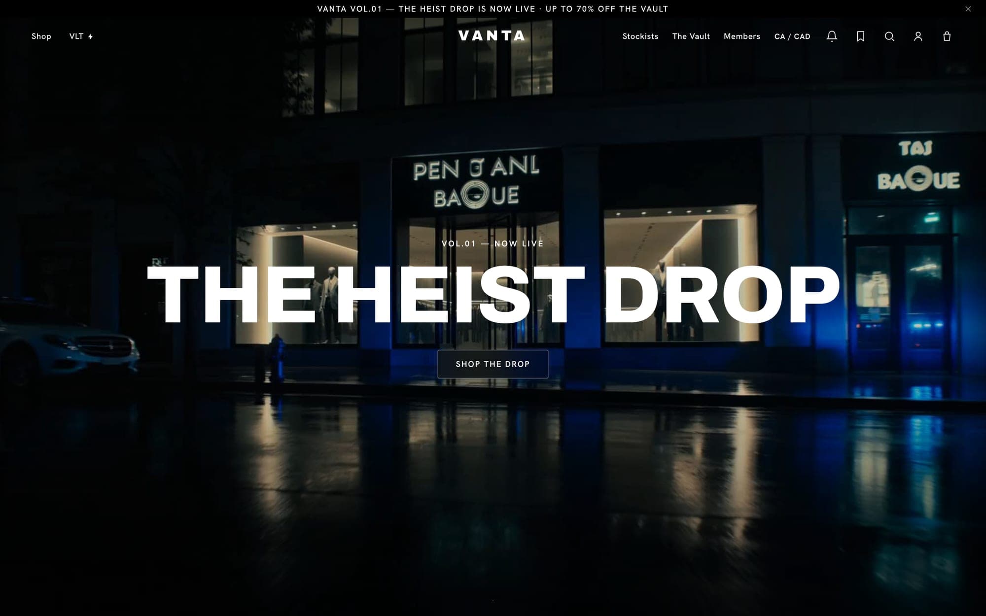
Most sites get motion wrong in one of two directions. Either nothing moves and the page feels abandoned, or everything moves and it feels like a slot machine. The expensive version is specific. Clarion's headlines arrive letter by letter, and its showroom banner holds still while the collection slides past. Vanta, a streetwear store, opens on a film of a night-time heist outside a boutique, because a drop is an event and events deserve an entrance.
6. Navigation as a designed object
On an assembled site, navigation is a row of links. On a designed one, it is an object with a point of view. Clarion's menu is a floating pill at the bottom of the screen, where a thumb actually reaches. Vanta's logo changes shape as you scroll. These are small details, but visitors register the difference between a site that was assembled and one that was designed, even when they could not tell you what it was.
7. Fewer, better sections
The last decision is the hardest one: leaving things out. Cheap sites say everything, every service, every testimonial, every badge. Expensive ones choose. A hero, a point of view, the work and a way to get in touch. When every section has earned its place, the page reads like an argument instead of a brochure.
Luxury is mostly a list of things you decided not to do.
Start from the finished thing
Every template in the UOVA library is designed around these seven decisions before it is ever filled. That is why a site generated in a minute can hold its own next to one that was commissioned. Pick the design closest to your business, describe what you do in a sentence, and see how much of the work is already done.