

Editor overview
The editor is where you change a generated or template site: select an element on the canvas, then edit it from the toolbar, the inspector, the icon rail or the AI chat.
For the complete documentation index, see llms.txt. This page is also available as Markdown.
The editor has three working areas: an icon rail on the left, the canvas in the middle and the inspector on the right. A top bar above them holds the page switcher, device preview, undo and redo, and Publish. Click an element to select it, double-click text to type over it, and use the inspector tabs to change how the element looks and behaves.
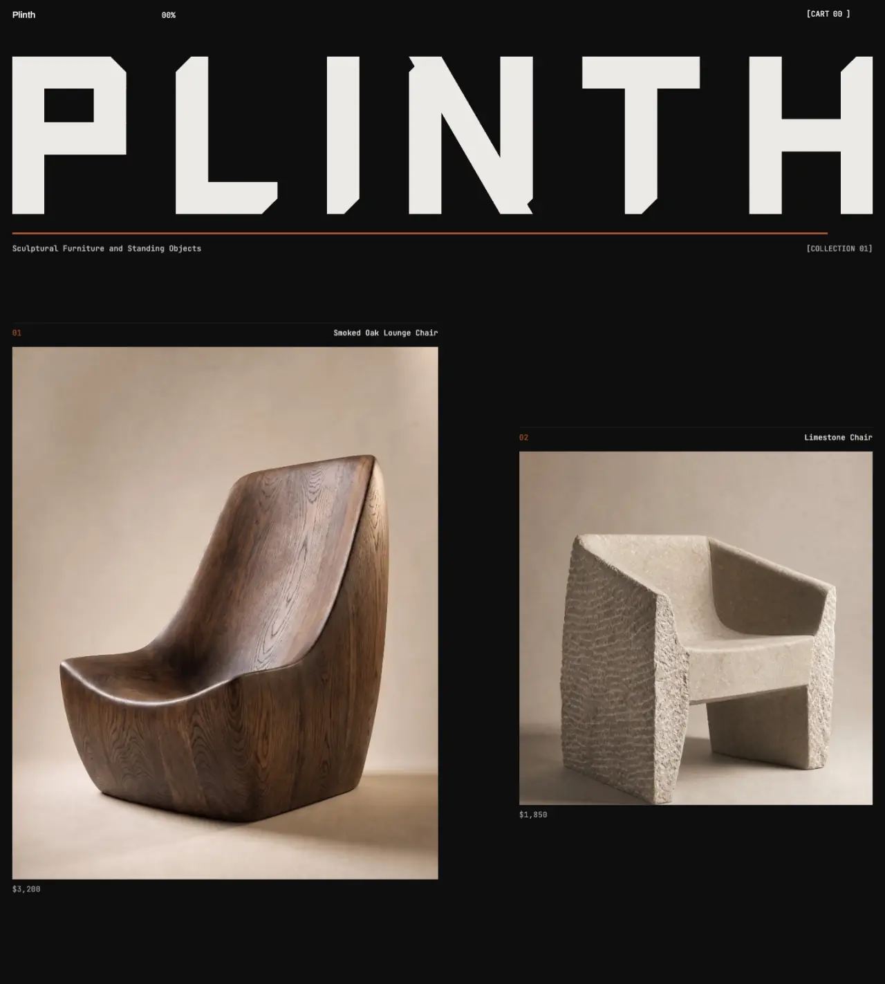
Plinth
Home100%
SharePublish
DesignContentImagesAnimateSEO
Select an elementClick anything on the canvas to start editing its look, content, and motion.Or ask UOVA →
- 1Top bar. Project menu, page picker, Desktop, Tablet and Mobile, zoom, Undo, Redo, Preview, Share and Publish.
- 2Icon rail. UOVA AI, Media, Sections, Add Elements, Layers, Pages, Site Styles and Version history. Store templates add Products and more.
- 3Canvas. Your page. Click an element to select it; double-click text to type over it.
- 4Inspector. Design, Content, Images, Animate and SEO for what you select. SEO works with nothing selected.
#The basics in four lines
- Click selects an element. A 2 pixel indigo outline shows the selection, and a small toolbar floats above it.
- Double-click a text element to edit it in place.
- Add things by clicking cards in Add Elements. Nothing is dragged in from a list.
- Every change autosaves. Press Publish when you want the changes live.
#Four ways to change one thing
| Way | Best for | Where it writes |
|---|---|---|
| The floating toolbar above the selection | Quick text, image and spacing tweaks | Always the Desktop styles |
| The inspector tabs (Design, Content, Images, Animate, SEO) | Exact values for one element | Design tab: the size you are previewing |
| Site Styles in the icon rail | Colours and fonts, plus button shape where the template supports it | The whole site |
| The AI chat | Changes to many elements, or wording you would rather describe | Content and the Desktop styles |
#Every editor guide
Editor layoutEvery region, the top bar, the menus and the rail.Edit textIn-place editing, the toolbar, typography and fonts.Buttons and linksAdd a button, set its label and where it goes.Images, video and mediaReplace, upload, generate and organise media.The Design inspectorEvery control in the Design tab, group by group.AnimationsEntrance, hover, scroll and loop animations.Add elementsWhat each card inserts, and where it lands.SectionsHide, delete and move sections, and what is pinned.Layers, move, hide, duplicate, deleteThe layers panel and the quick-action row.Keyboard shortcutsThe full table, plus when shortcuts do not fire.Responsive previewDesktop, Tablet and Mobile, and how overrides cascade.Undo, autosave and version historyThe undo history, autosave and saved versions.Edit with AI chatWhat the chat can change and what it costs.Forms and contact blocksAdd a form, choose fields and set the recipient.Site stylesTheme, colours, fonts, buttons and spacing.Custom CSS, HTML blocks and head codeWhat code you can add, and what is not allowed.
#Related areas
Pages and their navigation are covered in Pages and navigation. Search settings are in SEO settings. Going live is in Publish your site.