
Responsive preview
Switch between Desktop, Tablet and Mobile, edit each size on its own, and learn the real breakpoints your styles are written at.
For the complete documentation index, see llms.txt. This page is also available as Markdown.
The editor has exactly three sizes: Desktop, Tablet and Mobile. Pick one with the three icons in the top bar or with Cmd1, Cmd2 and Cmd3. Everything you change in the Design tab while a size is active applies to that size.
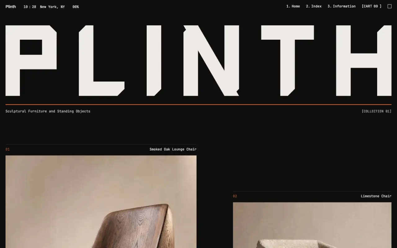
Desktop 1200 px
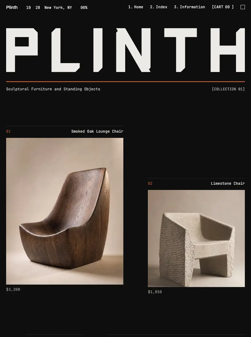
Tablet 768 px

Mobile 375 px
Design edits apply to the view you are in. Mobile inherits Tablet, which inherits Desktop.
#The real breakpoints
| Size | Preview frame | Styles apply at |
|---|---|---|
| Desktop | Fills the canvas, with a 1200 pixel design width | The base styles, at any width |
| Tablet | 768 pixels wide, 1024 tall | 768 pixels and narrower |
| Mobile | 375 pixels wide, 812 tall | 480 pixels and narrower |
Mobile inherits from Tablet, and Tablet inherits from Desktop. A value you set on Desktop shows on every size until you override it on a smaller one. The Mobile preview frame is 375 wide, but its styles apply to any screen up to 480 pixels wide.
#Edit one size
Step 1: Switch the size
Click the Tablet or Mobile icon in the top bar. The canvas resizes.
Step 2: Select an element
Click it on the canvas.
Step 3: Change a value in the Design tab
The value is stored for that size only. Desktop is unchanged.
Step 4: Check the other sizes
Switch back to Desktop to confirm nothing moved there.
#Overrides and the T and M badge
When a control has a value of its own at Tablet or Mobile, a small round T or M appears beside its label. It means this size overrides the larger one. Click it to remove the override, and the control goes back to the inherited value. The reset is saved as an undo step. Desktop never shows the badge.
#What writes to which size
| Change made with | Written to |
|---|---|
| Design tab controls | The size you are previewing |
| The arrow-key nudge | The size you are previewing |
| The floating toolbar | Always the Desktop styles |
| Custom CSS in the Advanced group | The Desktop styles |
| Hover Styles | Stored once, for desktop |
| Object fit in the Images tab | The Desktop styles |
| AI chat style edits | The Desktop styles |
| Site Styles | The whole site |
A Desktop value still shows on Tablet and Mobile unless that size has its own override, so a toolbar edit made while you preview Mobile is visible there as an inherited value.
#Stack a row on phones
Step 1: Switch to Mobile
Use the top bar icon or Cmd3.
Step 2: Select the container that holds the columns
Click it, or select it in the Layers panel.
Step 3: Set Direction to Column
In Size & Layout, set Direction to Column. Direction appears once Display is Flex. A grid with several columns needs its Columns value set to one column instead.
#Preview as a visitor
The Preview menu in the top bar has Preview in Editor, Preview in New Tab, Preview on Mobile and Preview on Tablet. The last two switch the size and render the page in a real 375 or 768 pixel viewport, so media queries and viewport units behave as on a device. The size icons only resize the frame. CmdP toggles clean preview.
#Limits
- Hover styles are stored once, for desktop, not per size.
- There is no custom breakpoint. The three sizes are fixed.
- Below 860 pixels of screen width the editor itself changes to a phone layout with Chat and Preview tabs. That is a different thing from the Mobile size.
- Zoom is separate: - and + in the top bar, from 25 to 200 percent.
#Common questions
Mobile inherits from Tablet. Set the Mobile value separately to make them differ.
Tablet styles apply at 768 pixels and narrower. A wider screen uses the Desktop styles.
Publish, then open the live address on the phone. In the editor, Preview on Mobile renders a real 375 pixel viewport.
The toolbar writes Desktop values. Use the Design tab with Mobile active to change one size.